Kahoot! What happened?
Has user experience and web design for Kahoot! been outsourced?
Yikes!
Let’s agree the web design company responsible for the “redesigned” Kahoot home page needs to be fired! The rebrand is so incredibly anti-end user, the web design and/or UX/UI company must be a secret competitor deliberately undermining what used to be a top educational gamification provider.
Yes, the Kahoot propaganda bandwagonning was suffocating. But teachers tolerated the excessive pandering because Kahoot! was actually quite fun. As an intensive reading teacher, I can attest student engagement was 100% and students begged to “play Kahoot!” Notably, I have been integrating Kahoot! in the intensive reading classroom since 2015.
As a teacher you would be hard pressed to attend a professional development and not be mandated to integrate Kahoot to increase student engagement. Public schools require students to have an “exhilarating experience” every day. The mandate is exhausting the incessant pandering to gamification and “fun experiences”.
So what happened to Kahoot?
*cough*. Kahoot Sold to Investors =Goldman Sachs for a billion.
The Kahoot! Website Is No Longer User Friendly
User experience (UX) design at the simplest possible definition requires ease of use for the end user.
This ain’t easy.
My definition of a user friendly experience: The efficiency of informational content to be accessed and understood by the end user. I would also add the rate of knowledge acquisition somewhere in the definition.
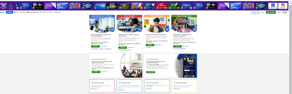
The scrolling banner. What do you want me to look at Kahoot?
Please! Too much stimulation! Are you selling a Disney Quiz because this is the first thing I see and I cannot look away.
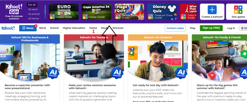
Home Page: What the World! What A Mess!
AI Distortion
How many times do we have to tell companies to hand edit AI prompted images? Come on! A billion dollar company cannot afford to pay a Fiverr graphic designer to use Adobe Photoshop to post process?
Small Font and Wacky Colors
If you have vision issues you won’t be reading the Kahoot website.
Look elsewhere.
Why is the font so small?
Why are there so many colors?
Clicking the alarming blue “Kahoot! For Business & Professionals” returns a cleaner blue simpler interface.

However, there is no continuity with the color themes because clicking the green “Kahoot for Family and Friends” returns unicorn purple ombré? Why?

Continuity
Users like continuity. The navigation through the website should be logical. When is continuity difficult for the user? When the user has too many options. There is too much going on (informal language)-the interaction lacks ease of use.
Pay Plan Options
You are going to go down a rabbit hole. Don’t get lost.
You get an option! You get an Option!
First click here:

Then,
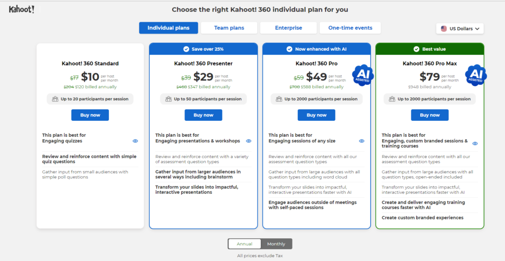
Keep going, (The web designer was tired) .
Save 12%.
Woohoo!

We made it!
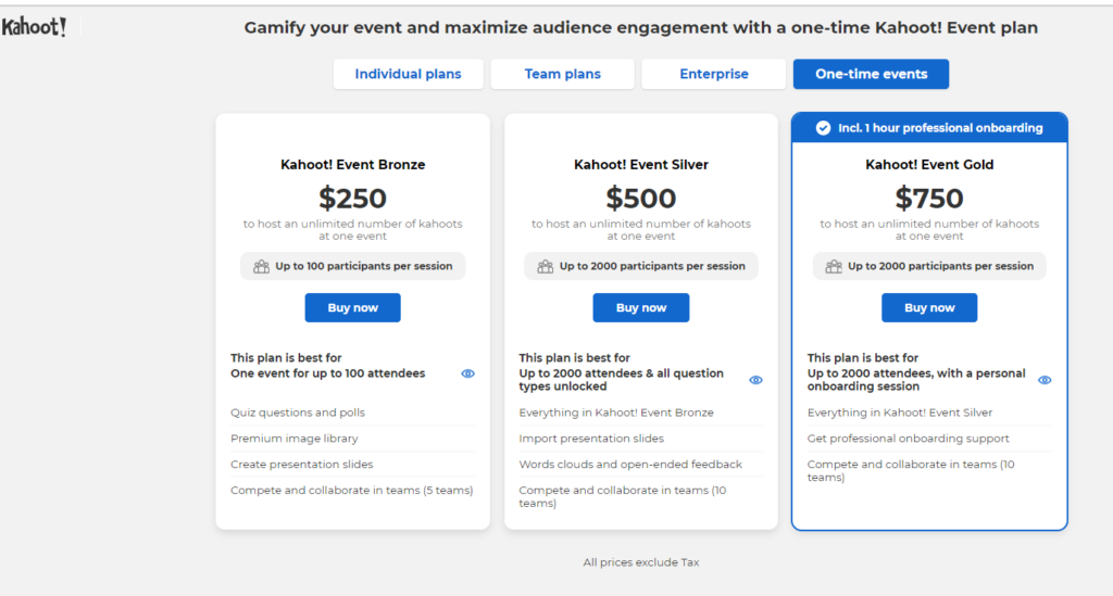
Why should an organization pay $750 to gamify an event.
Stop it.
ClutterBug Award:
The Kahoot! home page reeks of an obvious non-Kahoot user. It is usually obvious when companies outsource the web design and do not incorporate user experience surveys or focus groups before launching new and improved web content.
Clearly, the designer was petrified the end user would click away from the website so excessive content was stuffed on the home page.
A graduate degree in UX is not required to the significance of the adage, less is more.
Alternative straight-forward seamless educational gaming platforms like Blooket.com and Gimkit.com (both privately owned) are now highly recommended because the average teacher does not have 45 minutes to wrestle with the Kahoot! website.
Notably, Blooket’s designer, Ben Stewart personal website is painfully simplistic and similarly aligned to the simplicity of the Blooket platform.
Another alternative and Gimkit.com‘s founder started Gimkit.com as a high school project.

You will never be able to convince me the executives at Kahoot! surveyed end users prior to launching the revised website.
Executive Management is a Stark Reality of the Disconnect
The customer demographic statistics are not reflected in the executive management.

The sea of financial investors sums up the issue succinctly.
Mirroring education, the decision makers are politicians, lawyers, and investors.
The end user’s experience navigating the educational tool is not the priority.